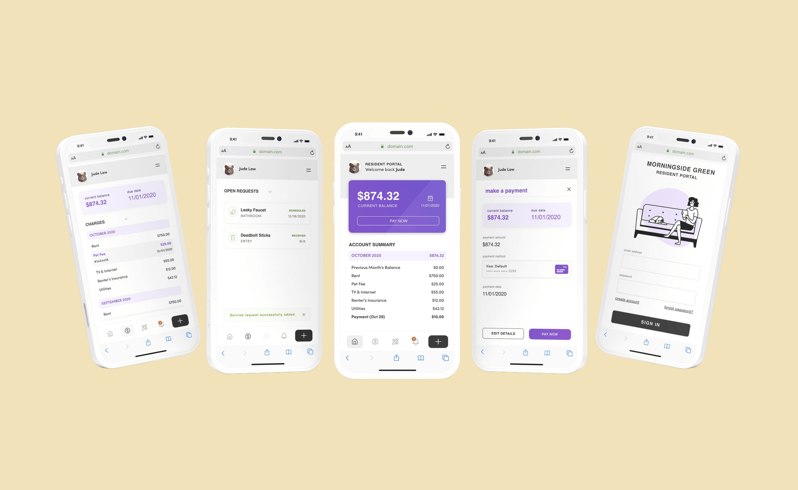
This resident portal project was a part of a larger property managment system called Quext. Ultimately, Quext seeks to stand out in the space by offering robust features in an easy to use and uncluttered package. For the resident portal, these goals remained the same while focusing on a wider and more general userbase. The purpose of the resident portal was to be used by the residents of the properties using Quext to accomplish all the tasks that go along with the renting process, such as paying rent and submitting service requests.
.png)
.png)
Systematized the service request process by integrating it directly into the app, making requests easier to submit, track, and manage for both residents and property staff.
Improved visibility and transparency, giving residents real-time insight into request status and reducing uncertainty.
Enhanced resident–property communication, creating a dedicated channel for ongoing interaction with the front office.
Strengthened resident confidence and control, leading to improved tenant satisfaction and stronger relationships between residents and property teams.


The main goal of the research was to discover, validate, or invalidate potential features for the resident portal. In addition to this, I wanted to develop a research plan that gathered large amounts of quantitative data to see patterns and smaller amounts of qualitative data to dig into the why of those patterns. With these goals in mind, the plan was to recruit a large number of people with experience renting an apartment, and with experience using a resident portal app as a part of that renting experience.
We had a decent number (160 participants) take part in a survey, and had a smaller amount (10) take part in both the survey and an interview session. To find these participants, I reached out to friends, family and social media. In addition to this, we leveraged resident and renting message boards to find interested and willing participants. The advantage of this project is that you did not have to look too hard to find our user group, many people have had some sort of experience with a resident portal app and with renting.
Obviously, I could rant on and on about everything that was learned during this valuable research time. Big insights. Small insights. Operational ones. Industry wide ones. But for our sake I will boil this down into the most critical insights we uncovered that directly informed the design and build of the app.
Following our research and discovery, we aligned around what our focus was in order to solve the right problems. Our problem statement was the culmination of everything we had learned thus far on the project and informed how we moved forward.
Residents need to be able to accomplish critical tasks associated with renting quickly and easily through the app. Additionally, users currently find frustration with the lack of communication to and from the property as it pertains to a variety of issues
The ideation process was primarily used to explore the communication and feedback process between the resident and property in specific contexts. We sought to understand the positive in-person communication and processes to try to model the communication in the portal after those real life exchanges.

We created a variety of journey maps that follow a variety of different starting places for the resident and outcomes. Above is a good example of how the services request process should go. Almost always the resident is starting the journey in a place of mild to considerable frustration, and the job of the app and property staff is to bring those frustrations down by addressing the problem, but by also giving the resident adequate transparency and communication into the request.

Through various ideation techniques we nailed down specific issues in the communication process that we wanted to address in the app. Many beneficial insights and design foundations came about through this process.
Following our ideation process, we now begin to establish the main app structure and flows with an understanding and approach.


Through establishing our flows and structure in a low fidelity stage, we more easily align and iterate by enabling and inviting visual collaboration.
Now we move on to wireframing, where we bring another level of fidelity to our process. In this stage, we mapped out the resident portal and the flows that comprise it.


At this stage, I collaborated with 2 UI designers who then led the UI design of the resident portal app. Collaboration with these designers began in the ideation stage where they were brought up to speed on the research and began to get foundations into the users and insights. In this stage, I collaborated and supported in various ways including UI support and design system build support.

