.png)
User Research
Journey Mapping
Sketching
Wireframing
Screen Flows
Visual Design
Interaction Design
Product Design Lead (me)
Senior UI Designer
Product Owner
Dev Lead
CTO
Engineering Lead
Front End Developer
QA Engineer
Back End Developer
Project Manager
CTO
Riff Raff Brewing Co. is a craft brewery in Pagosa Springs, Colorado, known for its creative beers, great food, and relaxed riverside setting at Riff Raff on the Rio. Founded in 2013, it’s a local gathering place for good drinks and good company.
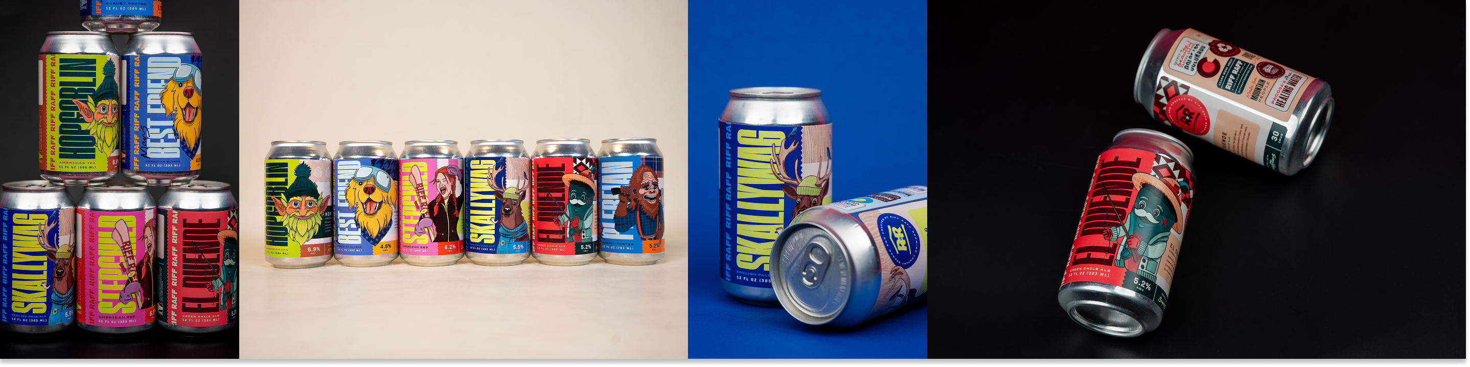
Riff Raff came to the table with dated label designs for their six flagship beers. The brewery felt they had outgrown these labels and sought to update their look to distribute and compete regionally.
The goal was to retain the authentic spirit of Riff Raff, while bringing the brand up to date.Through collaboration and iteration, we landed in a place that was bold and modern, but did not take itself too seriously.
Riff Raff seeks to update their flagship beer labels and branding in order to personify their unique character, and to stand out in a heavily saturated Colorado beer scene.
What are the key factors in the market and with the current site that will drive our descision making?
Audit other Colorado breweries (Odell, Ska, Telluride, Elevation, Upslope) to identify opportunities and trends.
Balance local appeal with broader marketability for distribution beyond the state.
How might we design to for visibility? First we need to understand the context of the purchase for customers. Early approaches were using color intentionally, designing for quick recognition, strong hierarchy, and creating curiosity.
When considering the regional market, and plans for distribution for growth, design considerations must be made to ensure a design system that scales easily for new releases and limited editions is built.
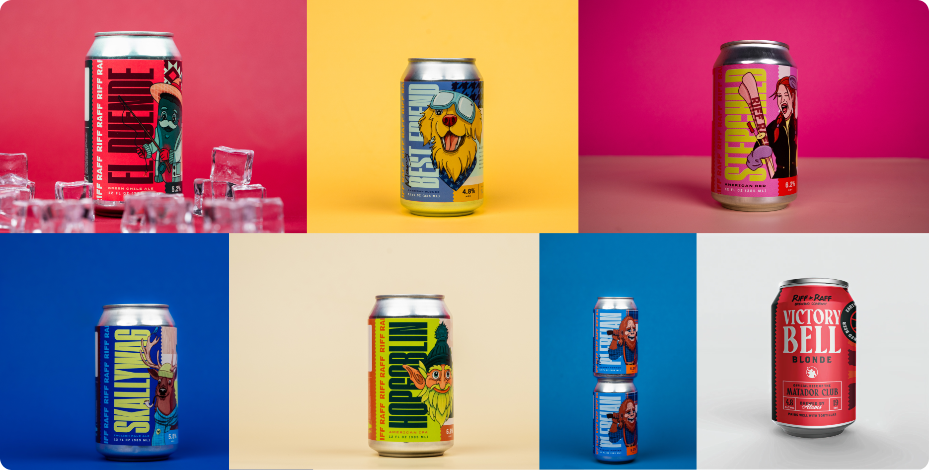
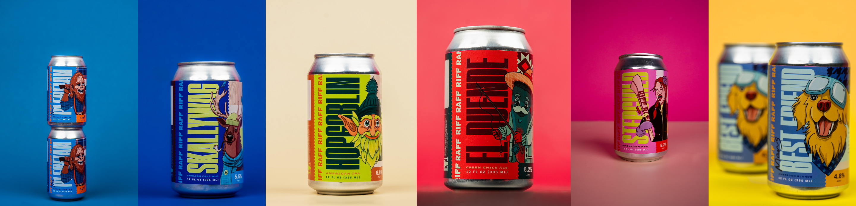
Riff Raff is endlessly distinct and interesting. The challenge was not in finding what makes this case special but rather, conveying the same eccentric and passionate character that has built the Riff Raff name.
We emphasized local roots, ingredients, attitude, origin story, and personifications of Pagosa Springs characters.
Southwestern Colorado has it’s own unique culture, one that we want to lean into when shaping the new labels.
This culture revolves around a rugged, outdoors lifestyle but also and shirt-off-your-back kind of community care for one another, and some of the most interesting characters to make up a town of 2,000.
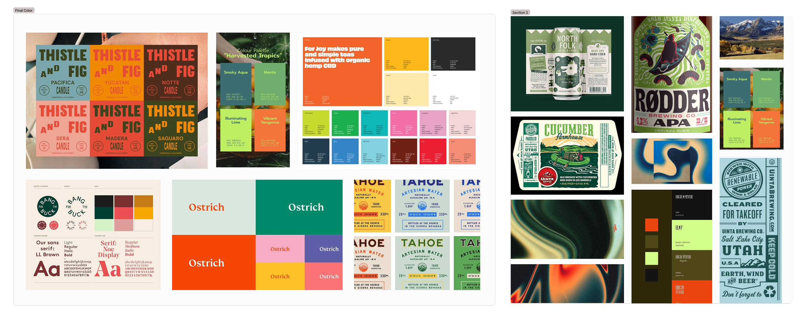
Following discovery and research, our process involved mood boarding with Riff Raff in order to clear a clear visual idea and language going. These mood boards were crafted very intentionally, with options representing distinct design directions, and also taking competitors and target audience into account.
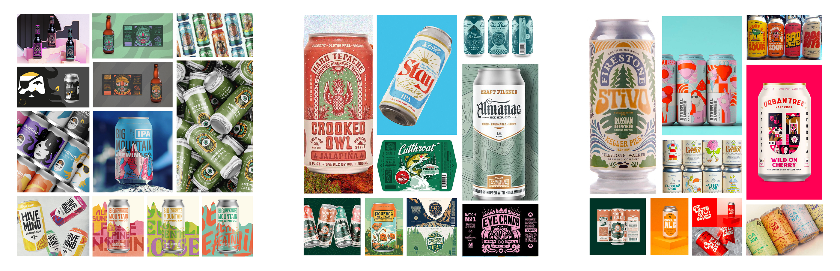
These mood boards captured a variety of different directions from illustrative to type-forward concepts. The boards ultimately served to help everyone get on the same page, and to move forward into the next phase confidently.
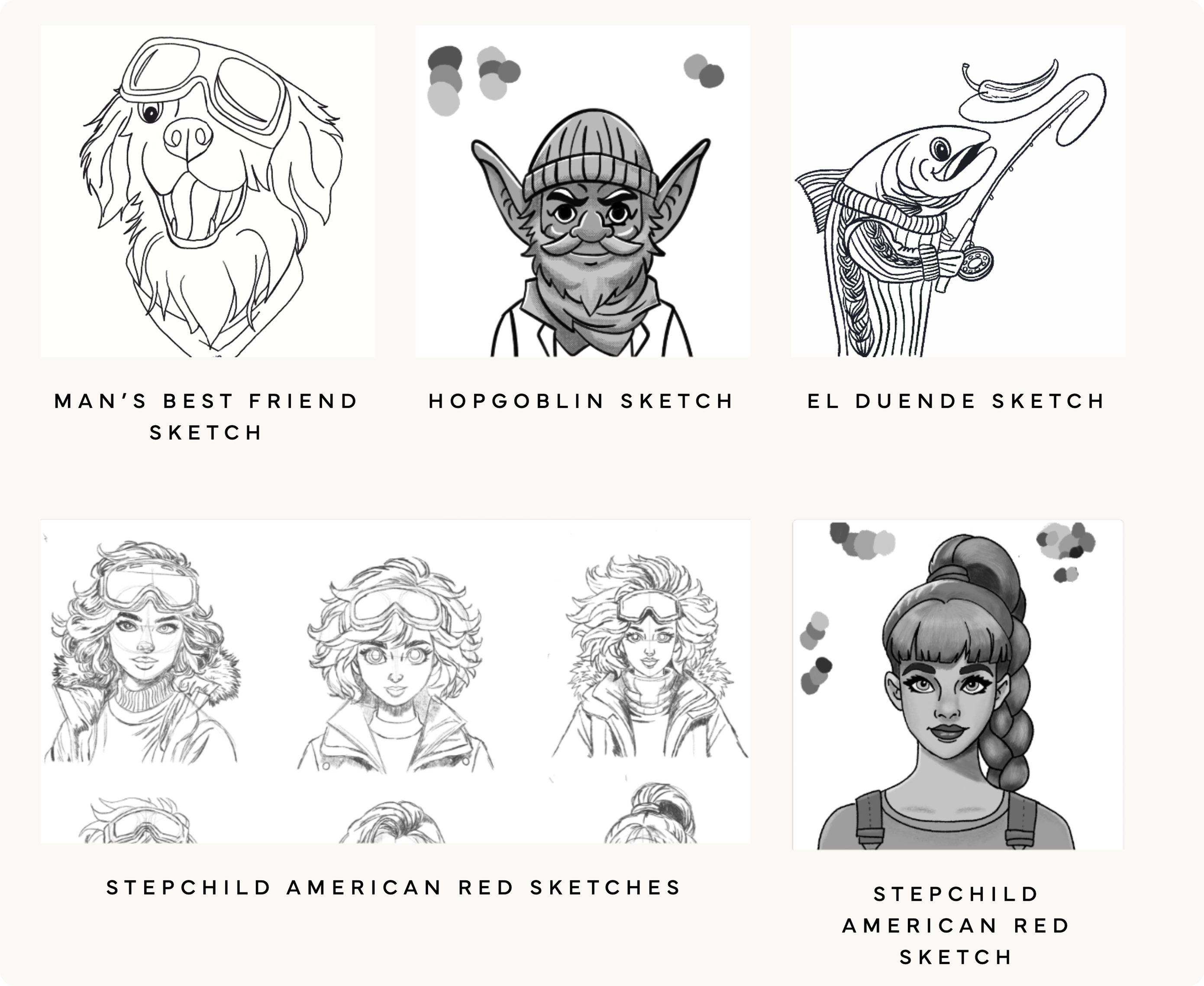
The stylistic direction agreed upon was an illustrative approachthat placed the flagship characters at the center of the story. These characters serve as a representation of the distinct personalities and profiles of the beers themselves.
Through a process of collaborative concepting and revision, our team was able to bring these unique characters to life.
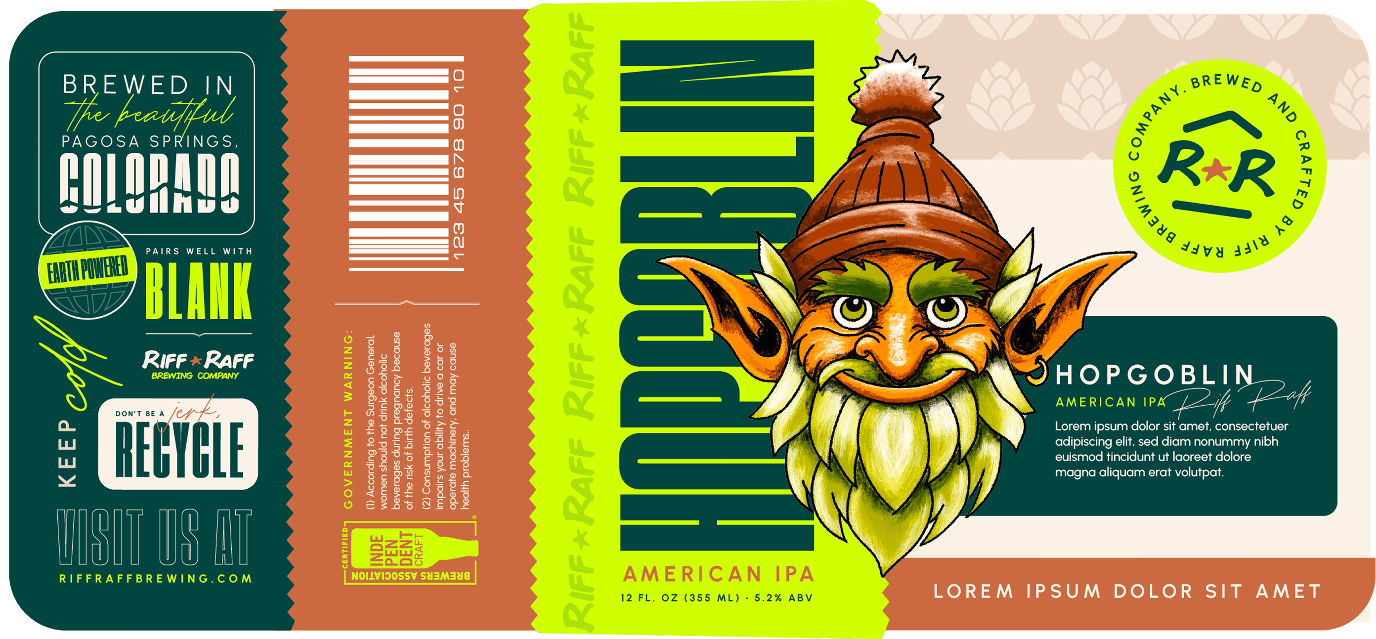
The new labels balance Riff Raff’s unique character with a visual style that grabs and holds attention.
The new labels are local and lived-in, something that speaks to both the community that built the brand and the visitors who come to experience it.
The new lables are part of a system that can adapt to new beer styles, seasonal releases, and different packaging formats
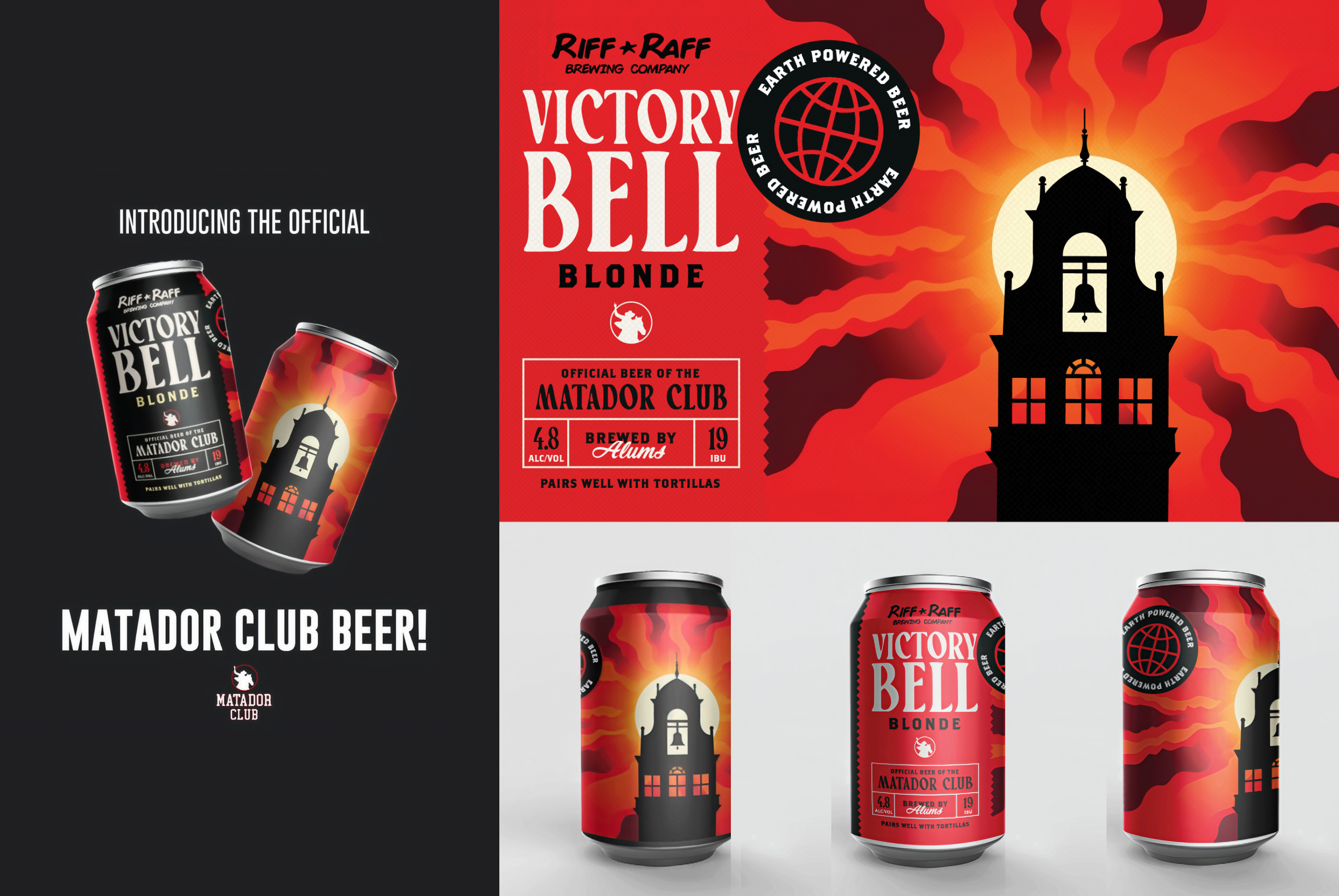
This was a beer label I designed for The Matador Club to be sold at Texas Tech tailgates for fundraising efforts. The inspiration was to bring the iconic design of the bell tower at Texas Tech to the label but to make it a little wavy and funky.